Zwei Personen vergleichen Farbmuster fĂĽr eine Wandgestaltung in einem Raum.

For your home

Trendy colours 2026

Colors set the mood in your home. They can make rooms appear larger, make them cozier, or give them a fresh, modern twist. And best of all, often just a few small accents are enough to achieve a whole new effect. The latest trend colors provide plenty of inspiration: sometimes warm and inviting, sometimes clear and calm, sometimes surprisingly bold. Here you'll find an overview of the latest colors, ideas, and tips on how to stylishly incorporate the latest shades into your rooms.

Trend colours are specified by the Pantone Color Institute

The Pantone Color Institute, a globally recognised authority on colour, provides information and solutions and has been selecting the colour of the year since 1999, which not only reflects the spirit of the times, but is already one step ahead of it.

Colour trend 2026

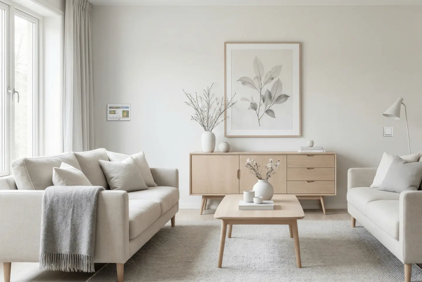
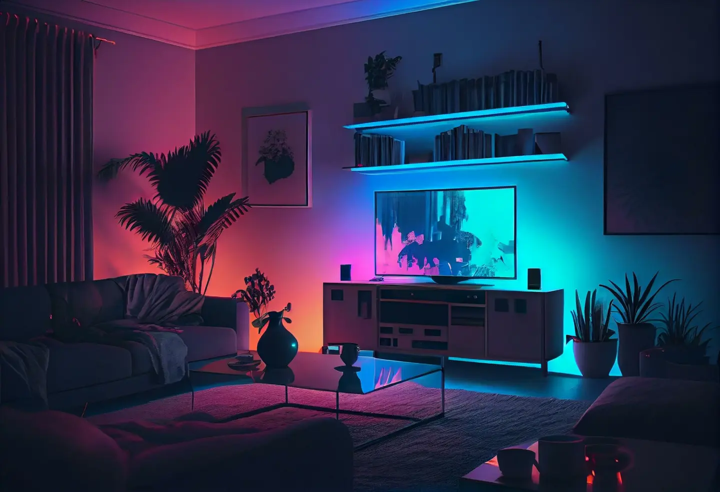
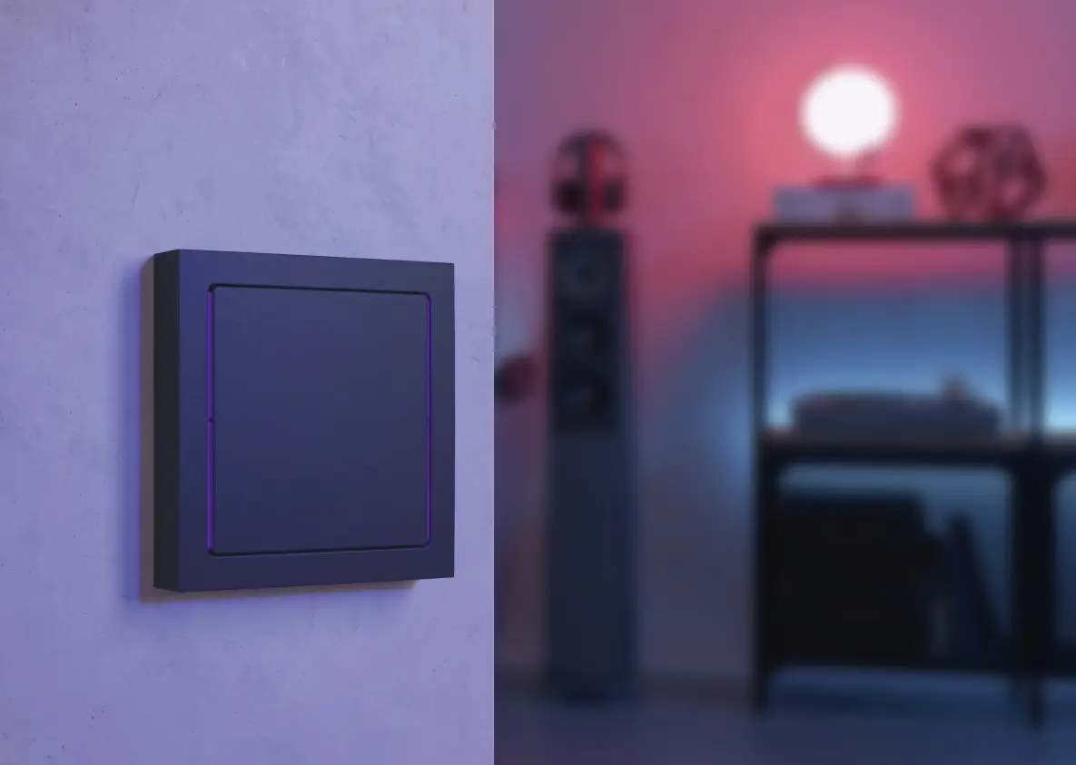
2026 is all about calm, clarity, and quiet creativity—with “Cloud Dancer,” the Pantone Color Institute has chosen a peaceful, cloudy white. The shade feels like a gentle pause in a noisy world: light, soothing, and full of space. Pantone describes “Cloud Dancer” as a color that invites us to quiet reflection while creating space for creativity, because often the most beautiful designs begin with a “blank canvas.” It is precisely this quiet strength that makes the shade so exciting. It allows materials, textures, and other colors to shine without pushing itself into the foreground. Whether as a wall color, for textiles, or furniture, “Cloud Dancer” brings serenity to the home and creates an atmosphere in which you can breathe deeply.

Strukturierte, sich in Erdtönen verändernde Oberfläche mit einer matten, kunstvollen Textur.

Colour trend 2025

2025 is all about warmth and comfort – with “Mocha Mousse,” the Pantone Color Institute has chosen a rich brown shade reminiscent of chocolate, coffee, and cocoa. A shade that perfectly captures the need for comfort and the little everyday pleasures. “Mocha Mousse” is versatile: whether as a subtle accent or a bold base color, it brings an earthy elegance that suits both minimalist and detailed designs. Above all, it creates an atmosphere in which you feel completely at ease. “The search for harmony permeates every aspect of our lives,” explains the Pantone Color Institute. “It gives us satisfaction, inner peace, and the feeling of being in harmony with our environment.” With its natural, warm radiance, “Mocha Mousse” creates precisely this harmony – whether on the wall, in home accessories, or furniture.

Ein sanfter, rosafarbener Farbverlauf ohne erkennbare Objekte oder Funktionen.

Colour trend 2024

"Peach Fuzz" is the colour of the year 2024. This velvety, soft peach shade is said to be good for our mind, body and soul. "We have chosen a colour that radiates warmth and modern elegance. This shade radiates compassion, is like a tangible embrace and effortlessly bridges the gap between youthfulness and timelessness," is how the Pantone Color Institute describes its decision. With "Peach Fuzz", you can create an inviting atmosphere in your interior design. This friendly peach colour between pink and orange creates a warm atmosphere. On a wall, in home décor or as an accent - "Peach Fuzz" enriches our individualised worlds with a cosy presence.

Einfarbige, strukturierte rote Textur ohne erkennbare Objekte oder Funktionen.

Colour trend 2023

2023 is the trend colour "Viva Magenta" - an intense shade of red reminiscent of ripe raspberries that is full of life and passion. The Pantone Color Institute describes it as follows: "A colour from the red family that is rooted in nature and sends out a new signal of strength. 'Viva Magenta' is bold and fearless, an exuberant, vibrant colour that radiates joy and optimism and opens a new chapter". Brave people buy a sofa or paint an entire wall in "Viva Magenta". If you prefer more restrained shades for your home, you can add trendy colour accents - with cushion covers, pictures, curtains, rugs or cosy blankets.

Einfarbiger, strukturierter Hintergrund in dunklem Lila.

Colour trend 2022

Pantone's trend colour of the year 2022 is called "Very Peri" and combines characteristics of blue tones with a simultaneous reddish-purple undertone. This stands for a vibrant, cheerful view of the world and a dynamic presence that inspires bold creativity and imaginative expression. Similarly, "Very Peri" symbolises an ever-increasing fusion of physical and digital life. A colour tone that catches the eye both as a wall colour and as a colour accent.

Graue Farbfläche auf gelbem Hintergrund, mit sanften Pinselstrichen und einer strukturierten Oberfläche.

Colour trend 2021

In 2021, the focus is on two colours: the solid "Ultimate Grey" and the radiant "Illuminating". The colour institute's reasoning: "In a time of continuing uncertainty, in which humanity wants to draw strength, clarity and hope, energetic colours give courage and joie de vivre". The bright, cheerful yellow "Illuminating" sparkles with vitality. Ultimate Gray" symbolises reliability and a secure foundation. The combination conveys a positive message of inner strength. You can bring the colours into your four walls individually or in combination with each other.

How do I find the right colour for my home?

4

The same rules apply for rooms with an eastern orientation as for west-facing rooms. The light is warmest here in the morning and becomes cooler and more subdued in the afternoon. Shades of blue or green are ideal as wall colours here - light and soft colours are recommended if you spend most of your time in these rooms in the afternoon. And vibrant wall colours work best in the morning sun.


Bright design, big impact: Cloud Dancer

Sometimes a single color is enough to instantly give a room more calm, space, and style. “Cloud Dancer,” the trend color for 2026, is perfect if you want a home that feels light, open, and tidy. Unlike harsh pure white, this shade has something soft, almost floating about it. It makes rooms appear larger, visually reduces pressure, and creates an elegant, timeless stage for furniture, art, and materials. Particularly appealing: you can combine “Cloud Dancer” tone-on-tone with cream, sand, or greige, or deliberately with strong contrasts such as black, dark wood, or rich color accents. This immediately gives the room character.

It's the details that matter

Alt-Text: GrĂĽner Schrank mit dekorativen Objekten und einem Lichtschalter, Blick auf den Essbereich mit einem Tisch und StĂĽhlen.
Ein rechteckiger Lichtschalter in einem rosafarbenen Rahmen.

In addition to different wall colours and colour accents for furniture and decoration, the matching light switches also make the difference - either as an eye-catcher or almost invisibly blending into the ambience. Our Busch-axcent® pure switch range, for example, is perfect for this. This combines high-quality real materials, such as glass or slate, as well as a lively colour palette with a linear look. The light switch thus lends expression to any individual style.

Frau sitzt auf einer Leiter und hält eine Farbpalettenkarte, nachdenklich mit der Hand am Kinn.

It's not always crucial to keep up with the various colour trends, because you can quickly get fed up with them. An individual colour scheme that suits you is timeless. It will always be perfect for your home and you will automatically feel at ease. With a "personal" colour, you express your own identity - and this is not subject to trends.

Not sure whether you like your new favourite colour? How about buying textiles such as cushions, rugs or individual decorative items in the colour in question first. And who knows, maybe you'll find your new favourite colour this way!

Highlight your new wall colour...

Wohnzimmer mit Fernseher, bunten Lichtern, Pflanzen und modernen Möbeln, die eine gemütliche Atmosphäre schaffen.
Junger Mann mit Brille hält ein Smartphone in der Hand und schaut nachdenklich darüber.

Illuminated walls or objects simply look more beautiful and striking. The natural incidence of light and artificial light can change colours considerably. With dimmable LED lights, the light colour can be adjusted from a bluish to a warm white light. Coloured LEDs change the atmosphere at the touch of a button. These can also be perfectly integrated into scenes in a smart home system such as Busch-free@home®. This allows you to create the atmosphere for a film evening or a cosy get-together with friends at the touch of a button and set the scene for your wall colours even in the dark.

... with intelligent lighting control

Dunkler Wandschalter mit quadratischem Design, an einer Wand befestigt, im Hintergrund schwaches Licht.

With our new Busch-Trevion® sensors you can set your wall colours perfectly in the right light. You have the choice, because in addition to a 2.4" display, the Busch-Trevion® sensor technology is also available as a keypad. In addition to the lighting, you can also use the control elements to control your blinds as well as the air conditioning and heating in your home. With a contemporary operating concept based on a capacitive surface, the sensor is operated like a smartphone with a tap/swipe function.